adianaresolve ©
MFT Soluções de Campo
Visual Identity,
Website
2026
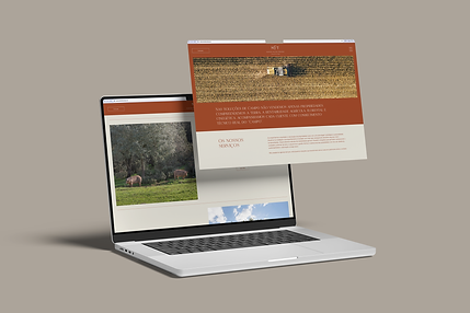
MFT's branding was developed with a focus on clarity, robustness, and efficiency, reflecting a brand oriented towards execution and concrete results. The visual identity is based on direct and functional language, with a sober and technical aesthetic that conveys confidence and competence in the field. The choice of colors, typography, and graphic elements was designed to create consistency and recognition, while reinforcing MFT's positioning as a reliable partner, capable of simplifying complex operations and delivering practical solutions.
The website was conceived as a strategic extension of this identity, prioritizing structure, readability, and conversion. More than just a digital presence, it is an operational tool that organizes MFT's offering intuitively, facilitating navigation and understanding of services. The clear information architecture, combined with a clean and objective visual approach, allows for immediate communication of value, aligning design and functionality to directly support the brand's business objectives.


+ projects